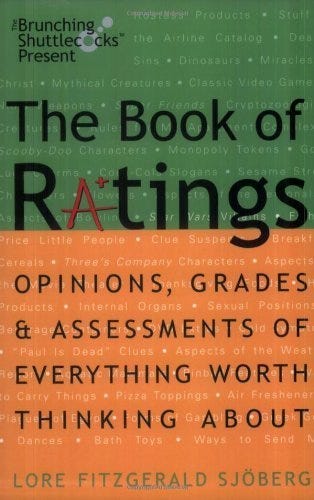
Here’s the cover of my book as published by Three Rivers Press in 2002. The subtitle came after some back and forth between me and my editor, and I didn’t have anything to do with the design other than approving it.
At the time I was so thrilled about being published by one of the Big Five, I didn’t give it as much thought as I ought to have. The main problem, I think, is that it doesn’t look like a humor book. In fact, I’m told it was sometimes mis-shelved as a reference work.
Here’s a mock-up of the cover I’m making for the re-release. The images will be original drawings rather than stuff I grabbed off Google Images, and it will either be an actual photo of sheets of paper on a table, or a better Photoshop job than this.
My hope is that this new cover will be a bit classier, and more importantly I think it both gets the premise of the book across better and is more clearly a humor book. I’m not a graphic designer by trade, but I’ve worked as one in the past and I’ve mostly done my own graphics design for my personal projects. I’ve also done illustrations for money, so I might try providing the art myself, depending on what an artist wants for a commission. I’d love to hear your opinion of it.
This would be a decent opportunity for AI art if I didn’t have so many qualms about AI art. The images just need to be generic versions of the things depicted, and they ought to be in roughly the same art style. But I’d rather put my own art on the book, or pay one of the many talented artists I know, than succumb to the temptation. I mean, I’m asking people to take my work seriously and pay for it, I feel like it would be hypocritical to not do the same with the art.
By the way, for those interested: My contract with Random House returned the publication rights to me after a period of time with no prints from them. I certainly hope that’s still standard contract language, it would be pretty exploitive to not publish someone’s book but not let them publish it either.


This is absolutely an improvement. It gets the point of it across in a visual instant.
Yeah, original cover does not convey "may contain lols". Your version is much better-- fun without being silly or worse, "zany". Distinguished humor for the intelligent chuckler.